NICK JR. BOOST
Rebranding and redesigning for a dual audience
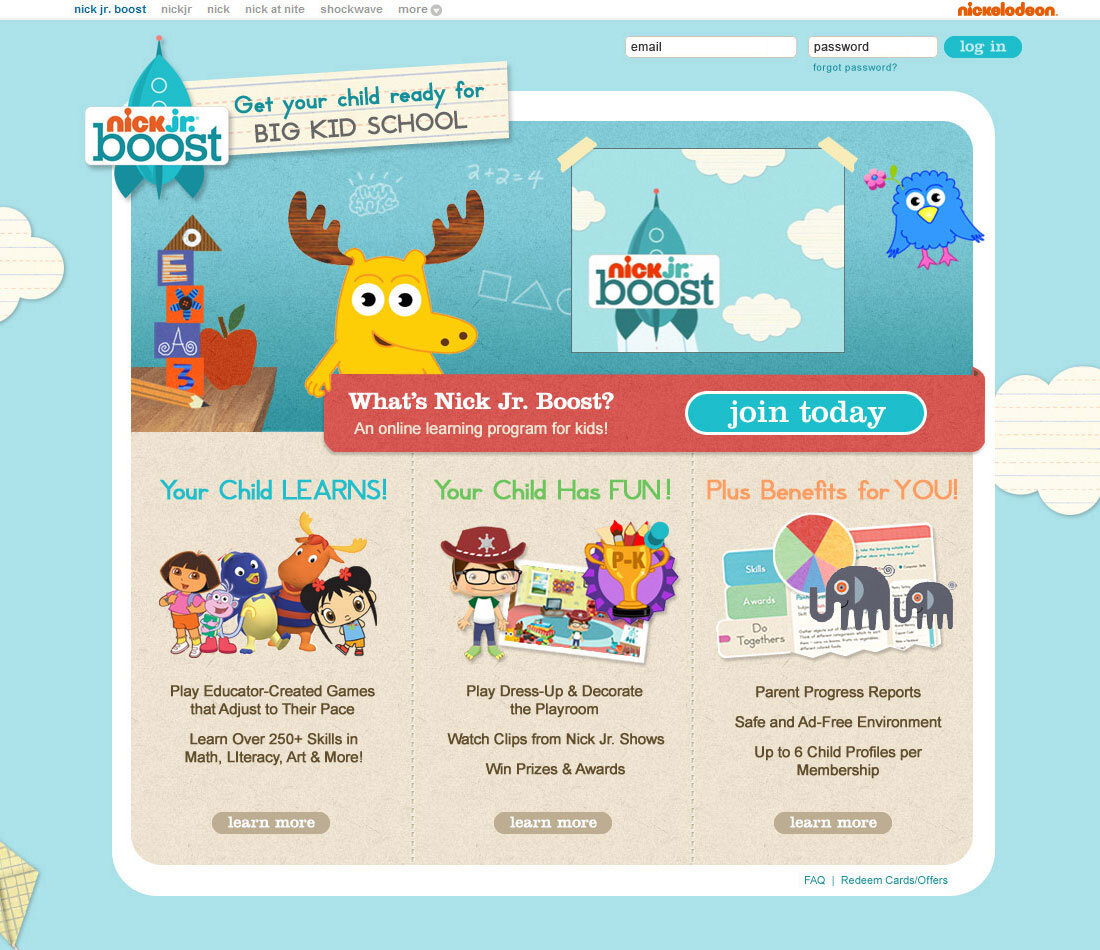
As part of a major Nickelodeon rebranding effort, the website formerly known as My Noggin was rebranded as Nick Jr. Boost, an educational subscription service for preschool kids. In addition to rebranding, we were also redesigning their educational subscription service, a website that included a portal to a Flash learning experience for kids that included interactive activities, videos and games.
THE PROBLEM
The brand MyNoggin was being rebranded to Nick Jr. Boost. We needed to create a new brand that felt like it was part of the Nick Jr. brand, but could have its own identity as a subscription service that was more focused on education. We also needed designs for two different audiences: parents and kids. In addition to rebranding, we were updating and developing brand new features that required new navigation and interface.
THE USERS & AUDIENCE
Nick Jr. Boost provided online learning resources and learning games focused on skills in math, literacy, art and more. The primary audience for the games were preschool-age children who had not yet started elementary school. The accompanying website was for parents, who could learn about the service, register a child and track progress.
THE TEAM & MY ROLE
I was the lead designer for the redesign of both the Nick Jr. Boost website and accompanying student experience, and also developed and designed the new logo. As design lead, I provided art direction to freelance and internal designers. Since this was a large project involving multiple resources and assets, I was both an individual contributor and an art director. I led the overall look and feel, designed the new navigation, and several of the screens, while providing art direction to external designers who worked on secondary screens. I also art directed a character illustrator who designed the style of the new avatar feature. I oversaw the production of all of the new design assets, worked closely with internal and freelance designers to guide their work, created Flash animations and illustrations, and designed the interfaces.
The core team included myself, a product manager, scrum master/project manager, and engineer. As the project progressed, we pulled in an illustrator from the Nickelodeon NY office who created the avatar character style, an internal designer to help with the micro-animations of the Flash navigation menu, and 2 freelance designers to help create the final assets. I was under the direction of the Creative Director from Nickelodeon’s NY office as well as my manager, the Creative Director in our SF office.
THE LOGO
The name “Boost” was a concept and name that originated with the product manager from our team. It immediately made me think of a rocket ship, which is something easily identifiable and resonant with young kids. The educational subscription service would enable your child to get a head start “boost” to their education. And a rocket is a symbol of exploration, perfect for preschool kids with curious minds about to embark on their educational journey. I iterated on my rocket idea quickly and delivered a few options for the NickJr team for approval. I felt confident in the rocket as the symbol we should use in the logo, and delivered a few variations of that idea. The new logo was approved quickly, without any major alterations. The swiftness of approval seemed like a great harbinger for the project. With the new logo complete, we moved on to the overall look and feel.
INTERFACE & VISUAL DESIGN
The existing Nick Jr. style guide had an established style: it used lots of paper textures, a light color palette and fonts that were geared towards young children. I used elements from this style guide, while also infusing new design elements to differentiate our site from the regular Nick Jr. site. While “Nick Jr.” was their kids’ brand, “Nick Jr. Boost” was meant to be their premium subscription service brand. As such, it needed to have its own identity (while also still needing to look like a Nick Jr. product). We did this by creating original artwork, including new paper patterns, original illustrations, lots of new interactive activities, and a new customizable avatar that was a core feature of the redesigned product.
We started by creating some mood boards for possible treatments for our product. These boards included inspiration images, inspiration words (fun, friendly, exploratory), example palettes, illustration styles and other elements that drove the first round of the project. For the overall look and feel, we wanted to be playful and fun, since the product was directed towards children. The website for parents needed to reflect that, but still had to present the information about the service for a parent audience.
We also used a lot of the existing Nickelodeon IP, which were recognizable to both children and their parents, to engage our users and entice them to register. The characters Moose and Zee were familiar to MyNoggin viewers so it was important to maintain them for the Nick Jr. Boost experience. In addition to the identifiable MyNoggin characters, we wanted to capitalize on the existing Nickelodeon characters like Dora the Explorer, Diego, and the Backyardigans, who would be familiar to both kids and parents.
Playroom as Home Screen
Since the audience was preschool children, we knew that most of our users would not be able to read, so our navigation had to be primarily visual. Our approach for the student experience was to make it very visual, intuitive and fun to explore. The “Playroom” concept as the home screen was a hold-over from the previous design, but we added a number of new elements: an avatar, a new navigation structure, and a new look and feel. The room contained various elements that would take you to other rooms/experiences throughout the house. There was also a traditional navigation menu that appeared on secondary pages once you left the playroom, but you could also navigate without the menu. From the “Playroom” the main areas of the site were the closet (the avatar tool), the TV (for videos), a bulletin board (awards), a bookshelf (interactive stories), board games (interactive games), an art easel (artwork), a room with a “toy machine” where you could use marbles to “buy” toys, and a toy box. In addition the main navigation, we had fun interactive easter egss like being able to customize the decoration of your room by changing your wallpaper, carpet and light fixtures, and hidden animations in the window and picture frames. All elements had animations to entice the user to explore. Finally, front and center was your avatar, who could be customized with skin color, hair and eye color, clothing and accessories.

Playroom home screen for kids
Design for the Parent Audience
The goal of the website was for parents/guardians to learn about the subscription service and what the kids’ experience would be. For the website, I pulled in many of the same elements and colors used in the Flash playroom. I used the same light blue background color, but added the paper clouds made of lined school paper. I also used a paper kite in the background to invoke “invention” (Ben Franklin!) and “flight” (echoing the “boost”). The sky blue background also made conceptual sense with the rocket logo…as your child will be able to soar to new heights.
Website for Parents

Avatar Customization - Flash Experience
Avatar Customization - Website

Parent Center - Website
There were some areas that we tweaked slightly in the parent vs. kid views. For example, the avatar builder had both a Flash version for the kids as well as a website version for parents so they could set up their child’s avatar when they first registered. The interface, though similar, was slightly different based on the audience. While the same core interface was used for the selection of customizable elements, the Flash version was more immersive, using the metaphor of a closet. The reuse of the core interface in the parent allowed for easier implementation but also gave the parents a peak into what the application experience looked like for their kids.
Avatar hairstyles

Original kids game interface (left) and redesigned interface (right)
OUTCOME
Nick Jr. Boost was delivered on time and well-received. I was proud of the work we did and felt we accomplished what we set out to do. I was especially proud that the end result was a cohesive experience, despite having several desigers, working in different locations and implementing a new look and feel. We tackled and successfully launched a complex project, on time and on brand.