EDUCATIONAL WEB APP DESIGN
Visual and UI design for students and teachers
THE PROBLEM
I was hired as a freelance designer to create the visual and UI design for a prototype demo for an educational software web application. Complex information needed to be presented to both teachers and students, with varying degrees of detail necessary depending on the audience. I played a key role in developing look and feel and UI issues around how best to present complex information in actionable bits.
These were the stated UX Goals from my client:
Minimal UI which is fun and easy to use
Step by step guided approach to goal setting/reflections
Actionable dashboard to show most relevant action for students to take (rather than all content)
Reusable elements such as “how do you feel” so users can quickly learn and anticipate
USERS & AUDIENCE
The app was to be used by teachers and students. While the overall UX patterns needed to be maintained across both audiences, there were different needs for each type of audience. Teachers needed an administrative view of their class, while students needed to see and track their individual progress.
ROLE
I was the lead product designer, working with the startup co-founders, who provided me with their user goals and existing wireframes. My final deliverables were visual mockups of some key screens for both teachers and students, as well as a style guide with specs for developers to build out the final prototype. These included UX patterns, visual style and technical specs on size and spacing.
DESIGN PROCESS
I came into the process after some initial work had already been done by my client in terms of user research. They had come to with a clear idea of what the product was and what they wanted their software to do for teachers and students. If a typical design process would include DEFINE >>IDEATE>> DESIGN >>TEST, then I entered the process soon after the “define” stage. The founders had come to me with a pretty solid definition of what it was that they wanted to do; it was now a matter of how best to do it.
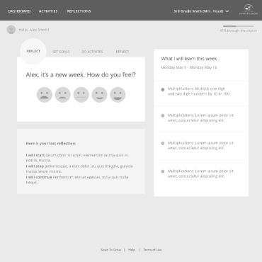
Wireframe for Students Dashboard
Still, I needed to understand the definition of the project. I began by assessing and understanding their main goals. What is the focus of the application? How would teachers and students use the product? What are the most important elements needed for each of them? I needed to focus on the educational model at the heart of the project: empowering students to be the driver of their own education. Students would set their own goals, reflect on strategies and “learn how to learn”. These were the core needs for students and teachers in the app, as defined by my clients:
Students: Set Goals / Track Progress / Reflect & Grow
Teachers: Set Up Structure / Explore Insights / Give Feedback
Style Tile
My client provided wireframes for the experiences they needed mocked up. Since I was on a tight schedule, I focused on interface elements and look/feel, at roughly the same time.
Look and Feel: I wanted a friendly & clean look, that would draw focus to the most important areas of the screen. To start off the project, I first created “mood boards” to share with my client. In conversations with my client, we discussed inspriational adjectives to help me settle on the right “moods”. These boards included a combination of inspiration with images, words and colors assembled to convey different moods. Once a mood was selected, I then created a series of “style tiles” These were similar to the mood board in terms of using them to get client approval for a particular visual approach, but honed in on interface details, with some suggestions for possible UI patterns in addition to a color palette.
Color: The color palette used subtle grays for the background, with meaningful pops of color. Color was didactic, as it provided a quick way to see and track progress at both the classroom and student level. Red, yellow and green were all used to track progression towards goals. I wanted a palette that was not overly saturated, which was important because these colors would appear frequently onscreen. I needed to hit the right balance of enough color to create emphasis without being overwhelming. The grays and whites that dominated the rest of the screen help the user visually organize onscreen elements. Important CTAs and progress indicators are emphasized with color while other background or less important interface elements recede.
We needed to take complex information but present them in a simple way. We also needed UX patterns that could be used for both students and teachers, with only slight variations depending on its use in the application. A lot of time was spent considering UI elements that would be reused across the application, most notably how best to visually represent mastery of goals.
UI DESIGN
Weekly display For the initial dashboard views for both teachers and students, we decided on a weekly view. This addressed the original client’s stated UX concern of wanting these screens to be in “actionable" to show the most relevant information rather than all at once. Focusing on one week is a typical way for teachers to work in the classroom and made it less overwhelming for both teachers and students.
UX Patterns There were many UX patterns that needed to be considered. I’ll focus on just a few of them here, rather than everything. One of the most important was how to display and track student progress on the mastery of skills. We needed to display multiple concepts: a number score (including a complete/incomplete if a score is not applicable), the emotional state of the student, what their stated goal was, and whether or not they had met that goal. This was a lot of information in a small amount of space. But it was also an essential part of their educational methodology.
UX patterns for mastery of student goals
The score was created in large, bold font and color was used to identify when a goal had been met, almost met, or not yet met. Emotional states of the student used smiley faces to indicate varying moods. We initially started with 5 levels of smileys (really sad, kind of sad, neutral, kind of happy, really happy), but later changed to a much simpler 3 level sad-neutral-happy. Those would be easier to parse at first glance, and we wanted these to be quickly understood.
I will admit that in retrospect, I would have liked more time to finesse the mastery of skills display. These versions look a bit too much like “progress” bars and the empty gray area could be misinterpreted as incomplete activities. I think if I had additional time for iterations, I would explore another way to display this information without using the “bar” shape, or at least eliminating the gray part of the bar. But upon further reflection (and after looking again at it with fresh eyes now), I would iterate on a few different approaches for this display, trying to remove the gray color entirely and having the red/yellow/green be the only colors reflected in the bar. The gray part of the bar, while allowing a light background for the stars and text to more legible, could be misinterpreted. I believe I initially decided on this approach to help reduce the amount of color on the page (it was overwhelming to have so much color dominating the screen), but would now advocate for a different approach.
For the teacher’s view, we wanted to reuse core elements, but had some additional considerations for which to solve: we needed to be able to display a lot of information in a small amount of space (to allow as many mastery indicators on the screen at one time as possible) and we needed a way to reveal details (e.g., how many students were in the “red” or “yellow” zone).
For this, we used hover tool tips on the master bar that revealed the # of students within each color. This gave the teachers a quick at-a-glance view of their class progress. While the tooltip can give this detailed information, the number of students isn’t as important as the percentage of students, so the color graph is more important than anything else.
At the top of the Teacher Dashboard, we highlighted the “class feelings” of the students. Hovering on the circle graph color sections would reveal a number of students in the center of the pie chart. It also displayed an end of week graph for comparison to see how the week fared for the class.
For the Teacher Activities view, I needed to find a way to show an at-a-glance view of a lot of students with a lot of information. We went through many variations before landing on our approach. Using the color coding, I needed to find the right balance of color vs white space, the right size for the numbers, and how best to represent when a goal was met. For earlier versions, I used the filled in circle star to represent a goal being met (as it is used in the student view). However, for our final version of the Teacher Activities view, we opted to use simple text “goal met” rather than the star icon, for simplicity’s sake. You can see in the examples of earlier versions that it helped to reduce the visual clutter.
Student Activities Screen
Activity Summary Module from the Teacher Dashboard
Teacher Dashboard View
Teacher Activities screen final version (left), earlier versions (right)
OUTCOME
Over the span of just 2 weeks, I delivered a number of different screen designs including the teacher dashboard, activities, and class list views, students dashboard and activities views, and also assembled a first draft of the style guide and specs for the developers to use to build their prototype. I continued delivering necessary assets for the prototype in the following weeks, and was also asked to design a few screens their website, including the home screen and about us pages. Our total collaboration was around 2 months, to complete both the product design discussed here, as well as the website deliverables.
My work was received well, and I was offered a full-time position. While I ultimately decided on a different opportunity, I’m proud of the work I did on this project and hopeful that it helped make a difference for students. I was not involved in testing or further iterations for this project, but I think we developed a good prototype that could not only sell the idea, but also gather feedback for future improvement.


