With over 15 years in the design arena, I've evolved into a seasoned Design Leader with diverse experiences across Educational Technology, Health & Wellness, Games, and E-Commerce. My journey has seen me shaping teams across the spectrum—from Product Design, Visual Design, UX/UI Design to Interaction Design, UX Research, and Copywriting. From software to mobile apps and websites, I've left my mark in Product Design, Branding & Marketing domains.
Transitioning from a Designer over 7 years ago, I've honed my skills not just in crafting designs but also in guiding teams towards excellence. While I started managing as a player-coach, I’ve since spent the last 3 years focused on leadership roles. I lead from multiple altitudes: from high-level concept design to pixel-perfect details. My strength as a Design Leader stems from my roots as a designer—I know the processes, empathize with the challenges, and help designers navigate them successfully. With excellent cross-functional relationships with Engineering, Product and Marketing teams and effective stakeholder communication, I foster effective collaboration and can drive innovation across teams. I always lead with kindness and empathy, and seek teammates who do the same.
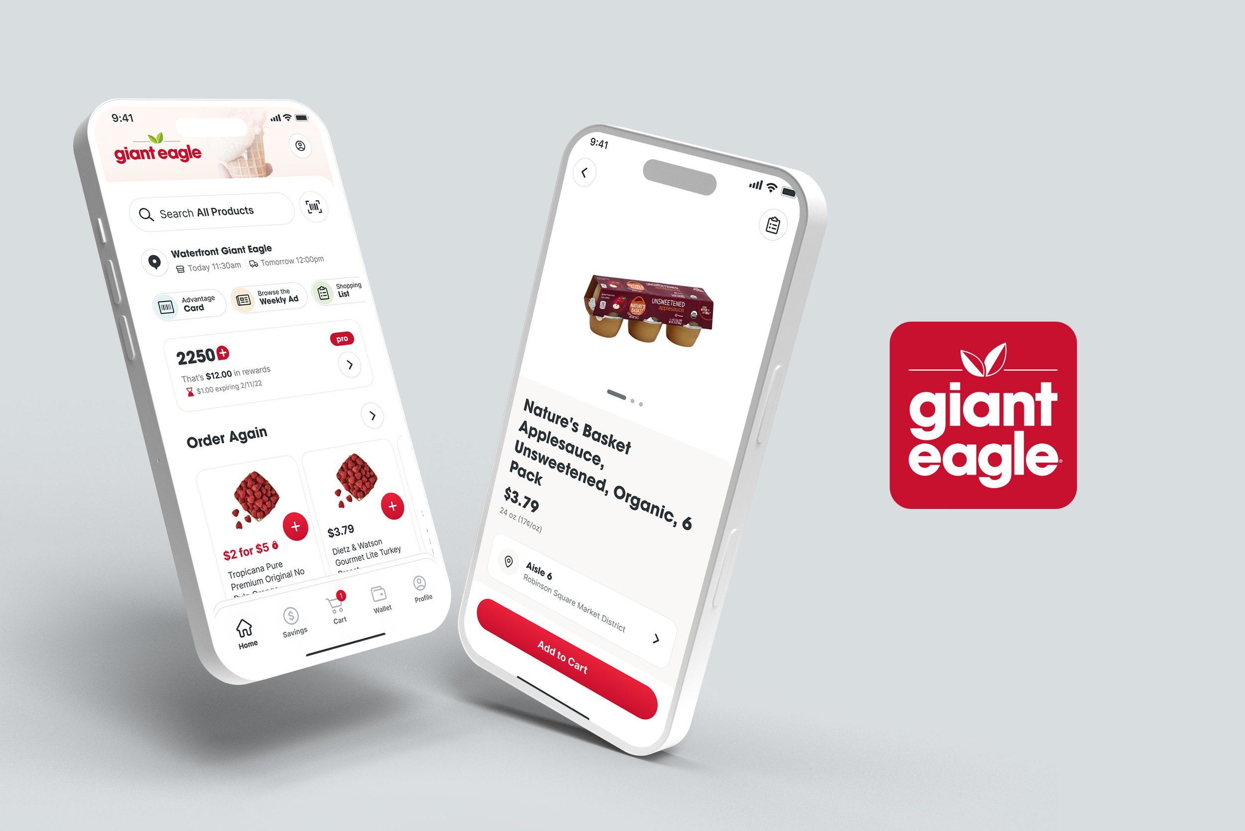
Giant Eagle is a supermarket chain based in Pittsburgh, PA with locations throughout the Pittsburgh, Cleveland, Columbus and Indianapolis areas. Hatched Labs was a San Francisco startup that was funded by Giant Eagle to work on their mobile app and e-commerce site. I joined Hatched Labs on the Product Design team and then transitioned to Giant Eagle’s Product Design team when they moved the Hatched Labs design and developer teams in-house.
I led the UX & Product Design team responsible for native apps and web experiences across 4 products spanning grocery, convenience and rewards: Giant Eagle & Market District (grocery), GetGo (convenience) and myPerks (loyalty rewards program).
During my time, we created designs for 3 mobile apps and 4 websites.
Giant Eagle App
Our grocery app has 2.1 million downloads. In 2023 we met a goal of monthly retention of Authenticated Users > 70%. We also met our metric of improving YoY % change in authenticated users, with an average 20% increase against a 10% increase goal.
GetGo App
In May 2023, we launched a redesign of the MTO (made to order) experience in our GetGo app that resulted in a 15% increase in mobile orders.
myPerks App
The myPerks app was a loyalty rewards app that was designed from scratch by the Product Design team. Early concepts began in April 2022 and we launched on an accelerated schedule to team members in December of the same year, eventually launching to the public in early 2023.
This was a herculean task to get an MVP released in 9 months with a small design team. Earlier this year, a business decision was made to pivot from a separate Loyalty Rewards app to integrating loyalty into our existing Giant Eagle and GetGo apps. Still, I’m proud of the work we did to create this app from scratch in such a short timeframe, and many of the features from the original app live on in our Giant Eagle and GetGo apps.
Giant Eagle Website
In 2024, we merged the e-commerce website with the gianteagle.com marketing experience to create one cohesive website. As part of this work, we created new processes and collaboration between cross-functional teams. Part of the consolidation involved design of new UX components that would be controlled via CMS, and we had to partner closely with Marketing and Content to understand what they needed to tell their stories.
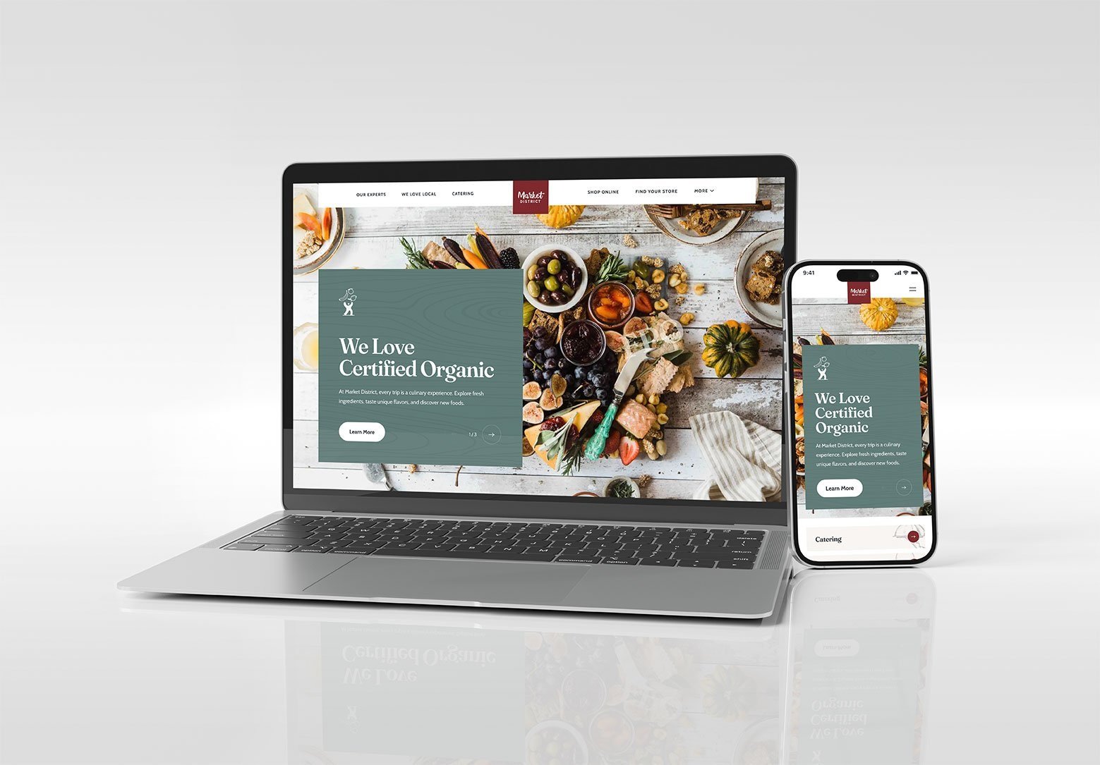
Market District Website
We redesigned the Market District website, in order to better reflect Market District’s “best in fresh” brand and to update underlying systems to make content easier to manage and share across our sites & apps. The result was a much more elevated and polished website that more accurately reflected the Market District brand.
GetGo Website
In January 2024, we also redesigned the GetGo website, hoping to drive more traffic to our app while improving our digital brand footprint. The original site was clunky, had outdated graphice and imagery, and needed to be upgraded. The new website is concise, simple, and encourages further engagement with the brand through our GetGo app.
myPerks Website
To accompany the launch of the myPerks app, we built a website to market and encourage download of the new app.
Role: Director of UX & Product Design, Art Director
The work shown here was created by multiple members of the Hatched Labs and Giant Eagle Product Design teams, under my direction.
Redesigning our Market District website
Market District is a brand of supermarkets in the Giant Eagle ecosystem. The Market District grocery website was outdated and in need of a revamp. In addition to low internal satisfaction with the existing website, the company was in the process of launching some new Market District stores, and we wanted a refreshed website to support the openings.
The original site held a lot of content, but did not accurately reflect the brand and was outdated in both appearance and content. We needed to better align the website with the brand we wanted to convey: a “food authority” and a destination for inspiration on eating well. The Marketing team at the time was even purposefully not sending traffic to the site because of so much outdated content. A refresh was needed that would allow us to actively market and encourage more customers to engage with the brand and shop at Market District.
ROLE: Art Direction, Concept Design
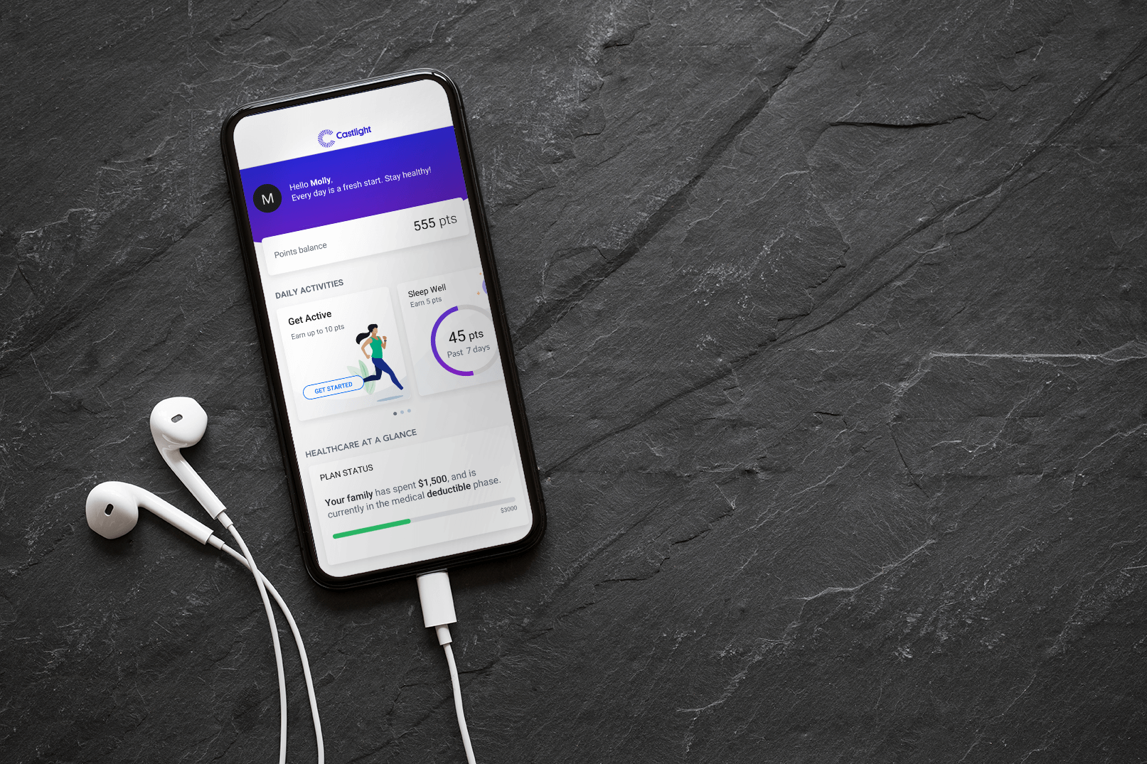
Castlight is on a mission to make it as easy as humanly possible to navigate healthcare and live happier, healthier, more productive lives. Our health navigation platform connects health vendors, benefits resources, and plan designs into one comprehensive app.
I led the team responsible for custom branding in-app and marketing materials to promote the app and its features. We created custom in-app assets with custom branding, color palette and images and developed the digital and print marketing materials to drive customer registration and engagement with our app. We also created email designs, illustrations, motion graphic animations, infographics, events graphics and custom in-app assets.
For our marketing work, we were gatekeepers for our corporate brand, but also attuned to the brand of our customer.
I managed the team through a company acquisition and two large migration projects and established new cross-functional design processes to improve efficiency and scalability. In addition to managing, I was also a hands-on designer .
Examples shown here are a combination of my team’s work and my work.
Role: Creative Direction, Team Management, Visual Design, Branding, Illustration
Digital Display, one of the marketing pieces created to encourage registration by our users.
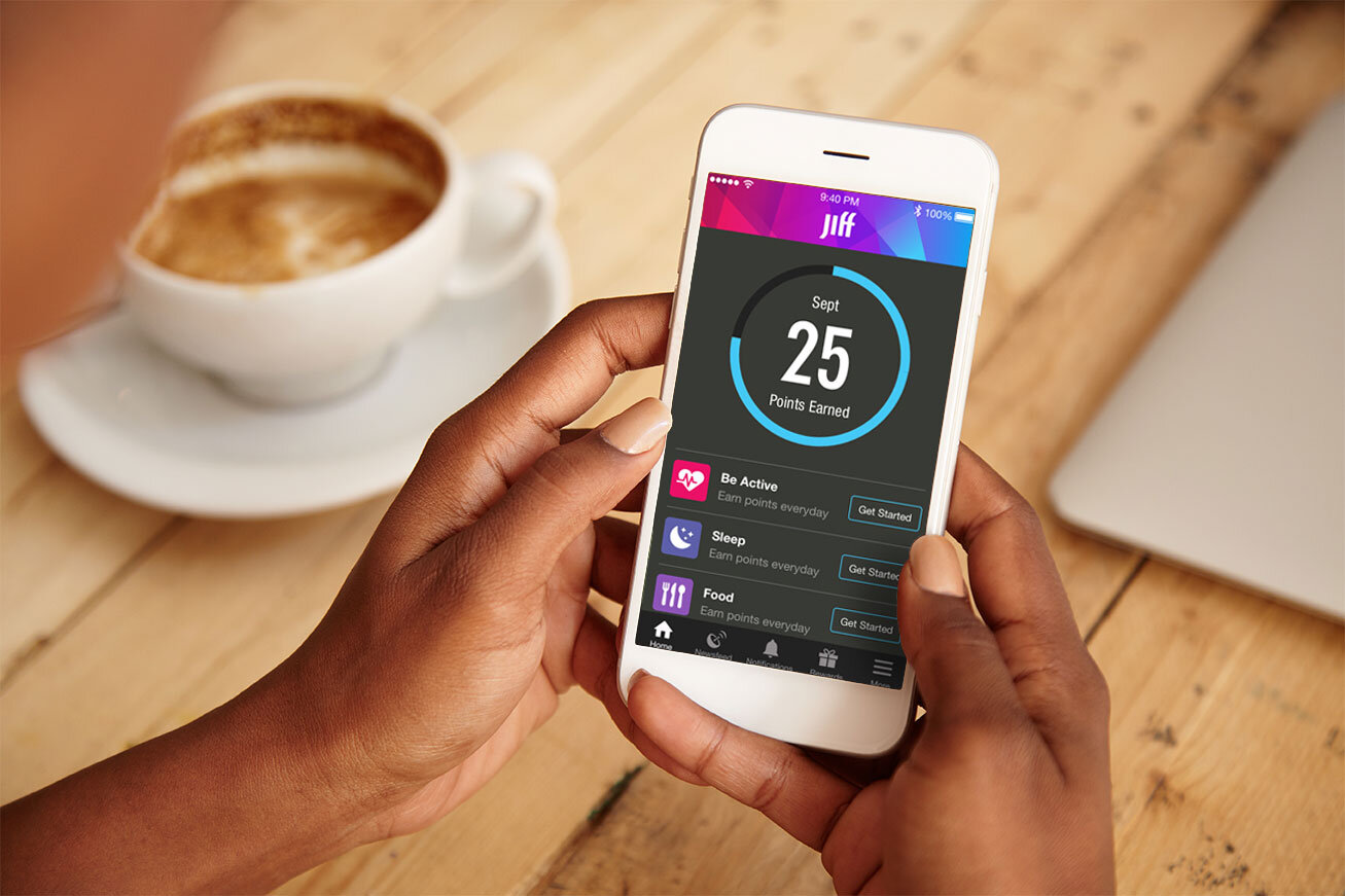
Jiff was an enterprise health benefits platform that helped organizations manage healthcare and lower costs by cultivating happier, healthier employees. The solution integrated and organized all existing vendors, and curated employee incentives. Companies are able to gather data from across a wide spectrum of wearable devices and mobile fitness-tracking apps to reward the employees who participate in digital health programs.
I led the team that customized the experience for our customers. This was a highly customized experience, with the ability to customize color palette and create custom icons throughout the app. We were additionally responsible for some light JSON coding and the delivery management of the assets, as well as all of the marketing materials to promote the launch.
Each launch included custom icons, custom images, JSON code, onboarding video, and marketing pieces such as posters, postcards, table tents and digital displays. While managing a small team of designers, I was also an individual contributor.
As the design lead, I implemented new design processes and also led the team through transition, when Jiff was acquired by Castlight Health in 2017.
Examples shown here are a combination of team members and my own work.
The Jiff mobile app, a health and wellness app used by companies to promote healthier lifestyles for their employees, also included fitness steps challenges. These steps challenge allowed users to earn rewards and incentives by exercising more each day. My team and I created several themes, building up a library of options so that customers could run more than one challenge a year.
YOLO (You Only Live Once) was a custom theme created for one of our customers. I created the in-app visual design, collaborated on the creation of the storyline, created illustrations and animated video, and designed all of the marketing materials used to promote the app with our customers.
Also shown are a number of additional themes, created by me and my team members.
Concept, Visual Design, Marketing Design
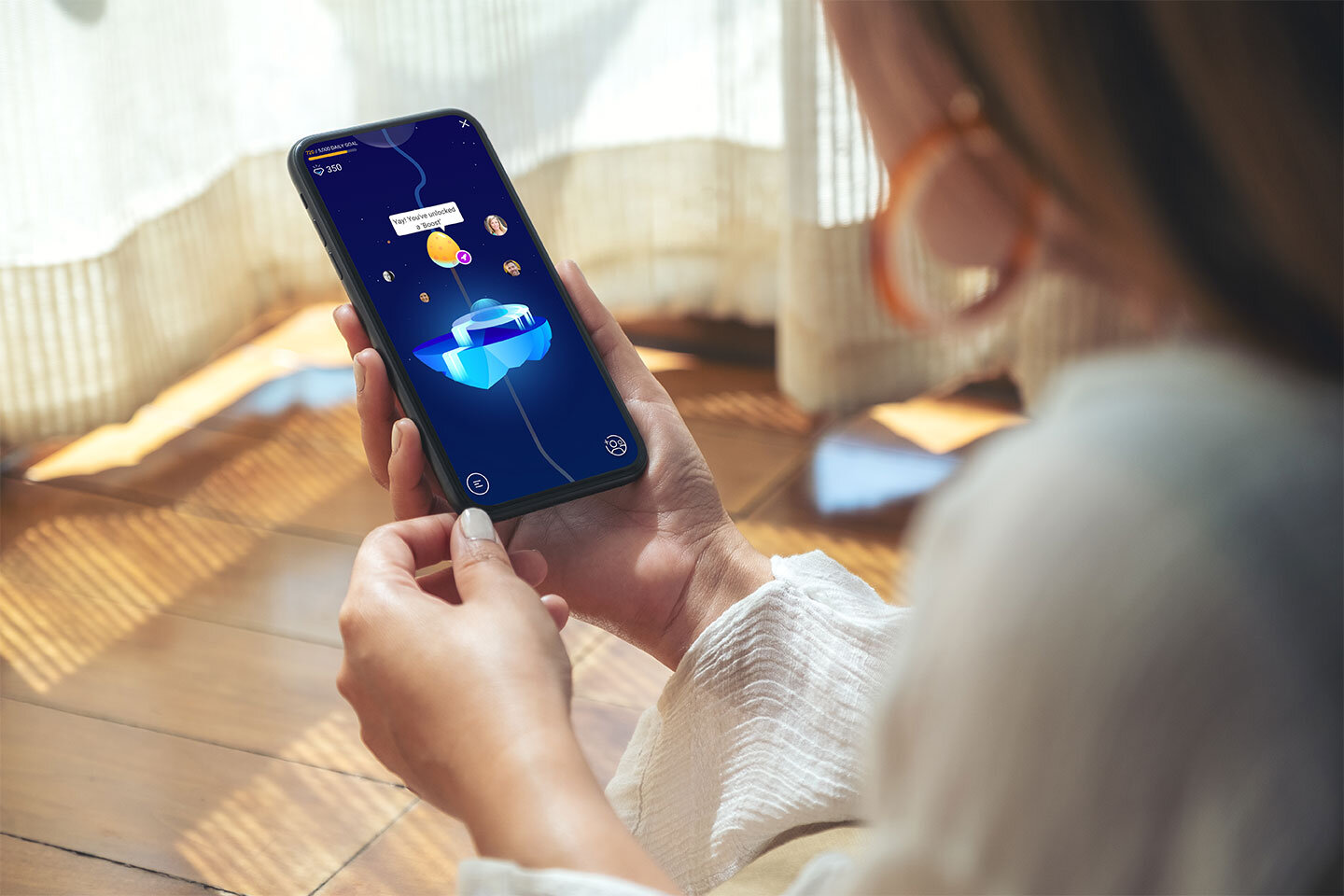
The Castlight mobile app included fitness steps challenges that encouraged healthier lifestyles. One of the most popular was called “Walk With Friends”, encouraging users to exercise daily while earning rewards and incentives from their employer.
This gamified, social corporate challenge exceeded industry expectations for daily engagement (>65%) and social inclusiveness (>75%).
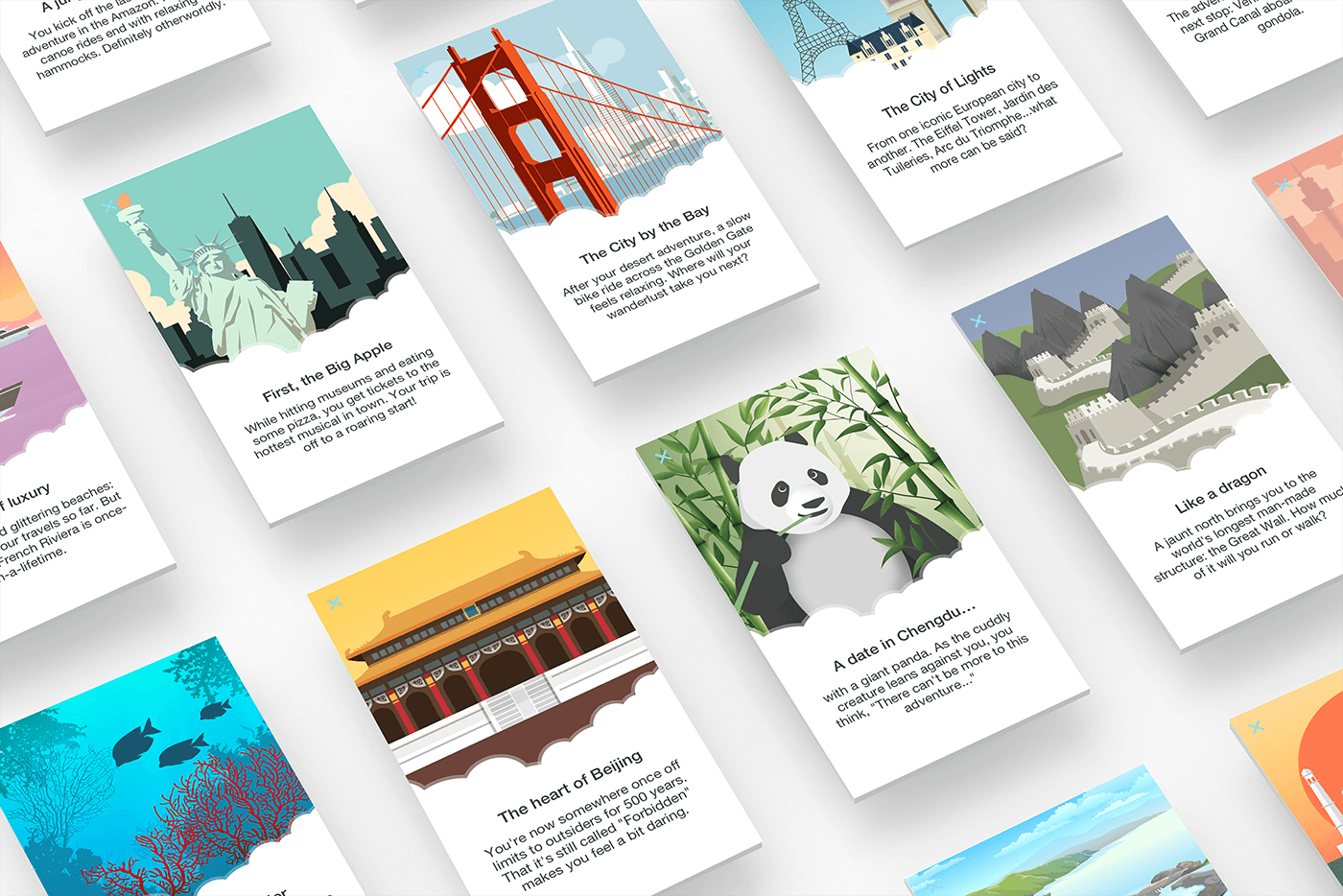
Since Walk with Friends was a popular feature, my team was tasked with conceptualizing additional themes for the challenge that could utilize the existing UX design, but infuse a new look and feel and storyline. We needed to find concepts that could hold wide appeal for an international audience. I came up with a nature theme, international travel theme and a retro arcade theme. Each theme required unique color palettes, avatar characters that could evolve, and level badges. There were some constraints involved in utilizing an existing UI and UX framework, mostly involving the mechanics of the path and the limitations to customization of the background imagery.
Learn more about this featured project.
Concept, Visual Design, Avatar Design
Concept mocks for Castlight Steps Challenge.
Concept mocks for Castlight Steps Challenge
Concept mocks for Castlight Steps Challenge
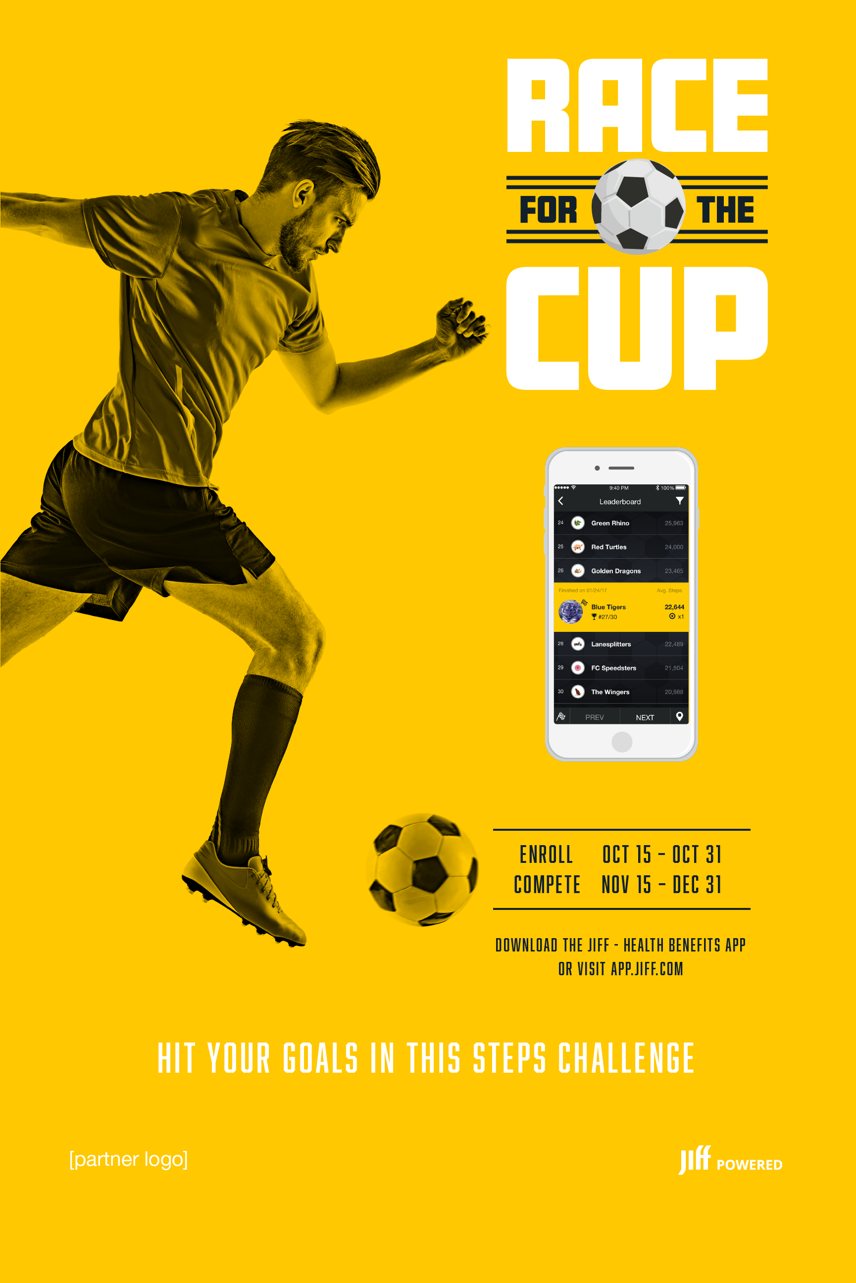
Race for the Cup was one of multiple themes that were created for a fitness steps challenge in the Jiff app. Jiff was a health and wellness app used by companies to promote healthier lifestyles in their employees. These steps challenges allowed users to work towards earning rewards and incentives by taking steps.
I created the in-app visual design, collaborated on the creation of the challenge storyline, created illustrations and animated video, and designed all of the marketing materials used to promote the app with our customers. To help increase engagement with existing customers and entice new ones, I took the initiative to have my team expand our library to include more themes. We doubled the inventory of our library, launching 13 new challenge themes. This increased engagement as customers were able to launch additional challenges with the new theme additions.
Visual Design, Marketing Design, Motion Graphics
Castlight had success with their gamified, social corporate challenges like “Walk with Friends”, which exceeded industry expectations for daily engagement (>65%) and social inclusiveness (>75%). Pivoting off the success of this challenge, a new fitness challenge was designed to encourage healthier lifestyles by encouraging and rewarding steps activity. The challenge centered around a theme of a race, with an “Around the World” theme. I worked closely with the UX Designer to provide in-app assets. I illustrated 10+ background assets for use in the mobile and desktop app, and developed SVG animation concepts.
There were some UX and visual challenges since we wanted to minimize the amount of SVGs needed and wanted the same SVG backgrounds to be used across mobile and desktop, as well as in multiple instances on various screens. The UI layouts required careful attention to the scale and composition of the illustrations, which needed to balance legibility of the interface with the visuals of the illustration. I worked closely with the UX designer to solve issues and create consistency and efficiency between the mobile and desktop experiences.
Illustration, Visual Design, Concept Design
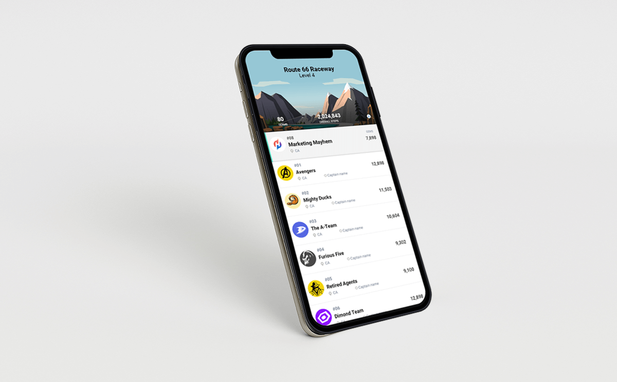
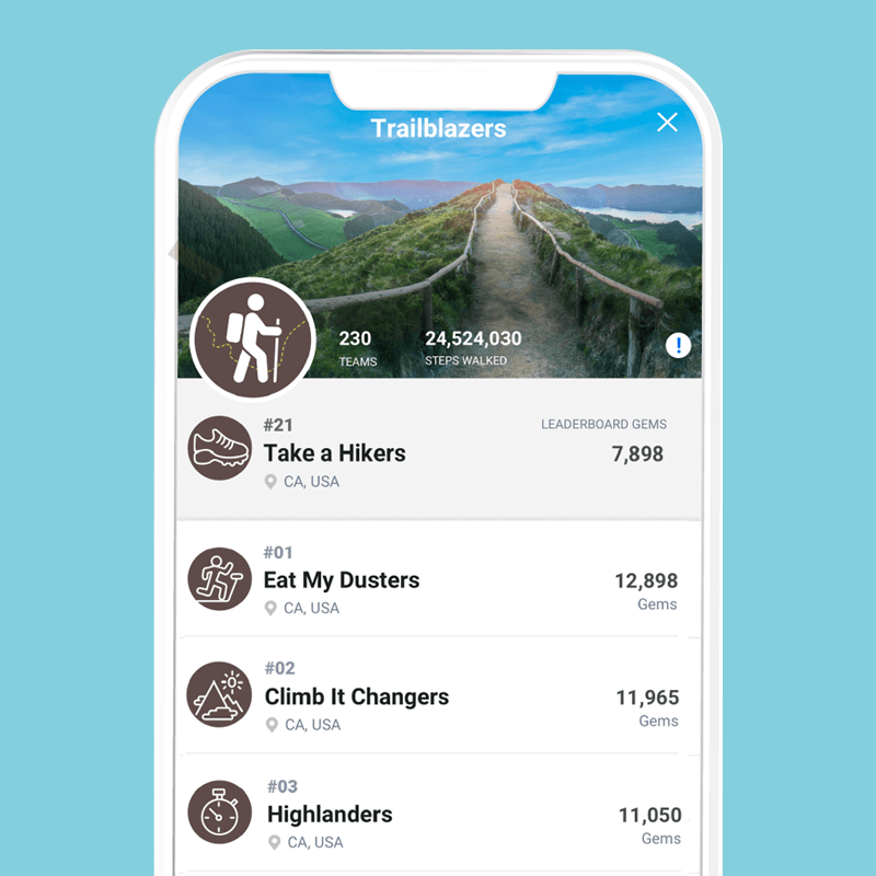
Castlight Health launched “Leaderboard” challenges as a new feature to help engage our users and encourage healthier lifestyles. They were a popular way for our customers to drive more daily engagement with their employees and encouraged new registrations into the app.
In order to reinvigorate interest in customers who may have already launched the original Leaderboard, we created new themes with updated look and feel for these challenge. Working closely with the UX designer, I created in-app assets and marketing materials.
Concept Design, Visual Design, Marketing Design
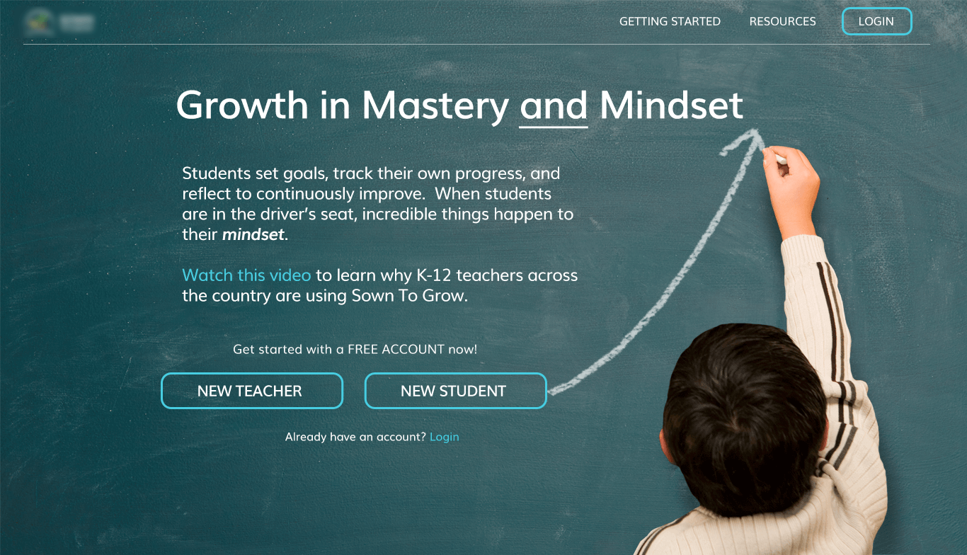
I worked with an educational startup that was developing an online tool for teachers and students, with a focus on growth mindset and empowering students to set goals, track progress, reflect & grow. As Lead Visual Designer, I provided UI and visual concepts for their web application. I also provided a Style Guide including specs and assets for the developers to build a prototype.
See more about this featured project.
Visual Design, UI Design, Art Direction, Style Guide Specs
Teacher View - Students List
Student View - Activities
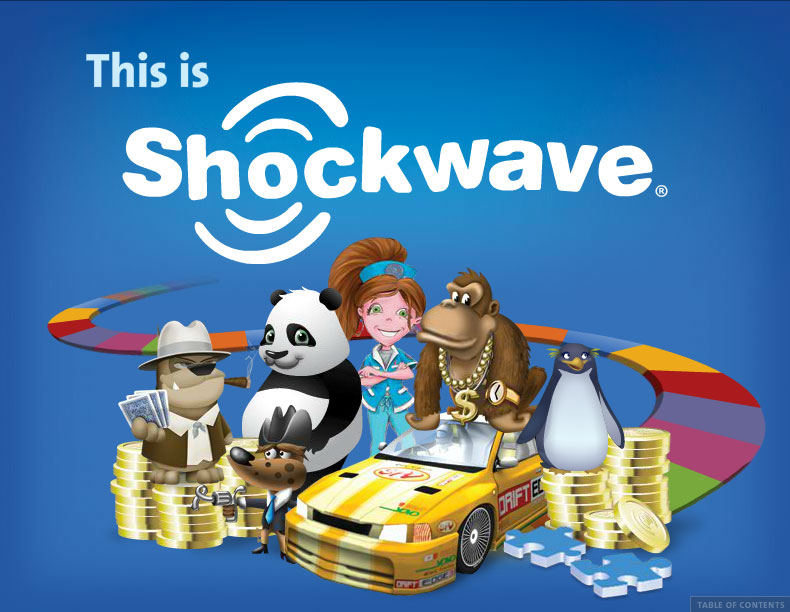
Our Creative Director tasked me with the role of Art Director on this branding initiative for Shockwave. With a tight turnaround and lots of moving parts, it was a challenge to develop the look and feel of the digital brand book as well as manage my fellow designers. I was a key contributor, helping to devise the initial game board concept, designing about half of the page layouts, and coordinating the final production of all of the pieces. In the spirit of the Shockwave brand, the book was made interactive with hidden puzzles & animated pieces scattered throughout.
Art Direction, Visual Design, Illustration
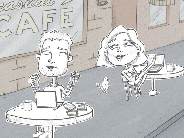
I was the Lead Designer on this promotional video for a subscription product for Shockwave.com, a casual gaming website. I designed the two main characters and created all of the illustrations, working closely with the animator and Creative Director. The goal was to inject some fun and humor into something that could otherwise have been a dull promotional message. Final animation was created by a teammate.
Art Direction, Illustration
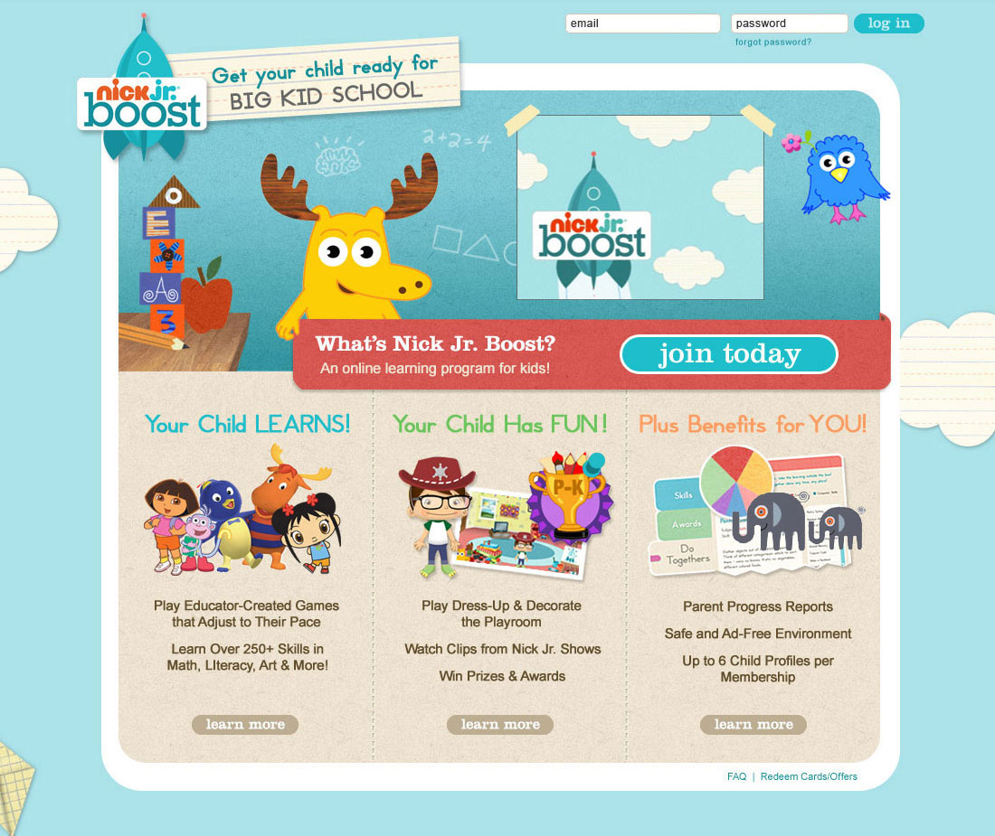
As part of a major Nickelodeon rebranding effort, the website formerly known as My Noggin was rebranded as Nick Jr. Boost, an educational subscription service for preschool kids. I designed the logo for the new brand, and was lead designer for the redesign of both the Nick Jr Boost website (for parents) and the Flash game interface (for kids). I also provided art direction to freelance and internal designers. The challenge was coming up with a fresh look for the new site, but one that still fit comfortably within the style of the Nick Jr. brand. I also had to cater to different audiences (parents and kids), while maintaining brand consistency.
Target Audiences: Preschool children & their parents
Positioning: Inviting, Friendly, Fun
See the case study.
Art Direction, Visual Design, UI Design, Illustration, Logo Design
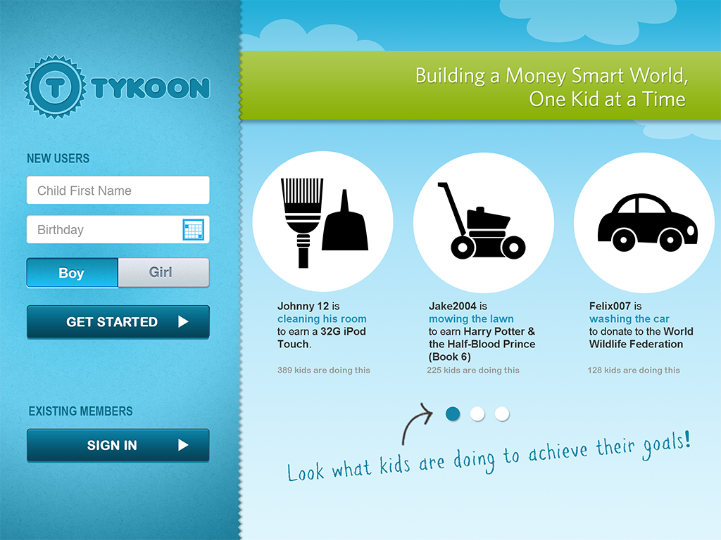
I was lead designer on this Tablet prototype for Tykoon, a financial education tool for kids. Tykoon enables kids to make smarter decisions using chore charts, savings goals, charity donations, and a controlled shopping experience. This prototype was built specifically for the iPad, as a mobile web experience. In addition to the site design, I also created a series of icons for the prototype.
Concepting, UI Design, Visual Design
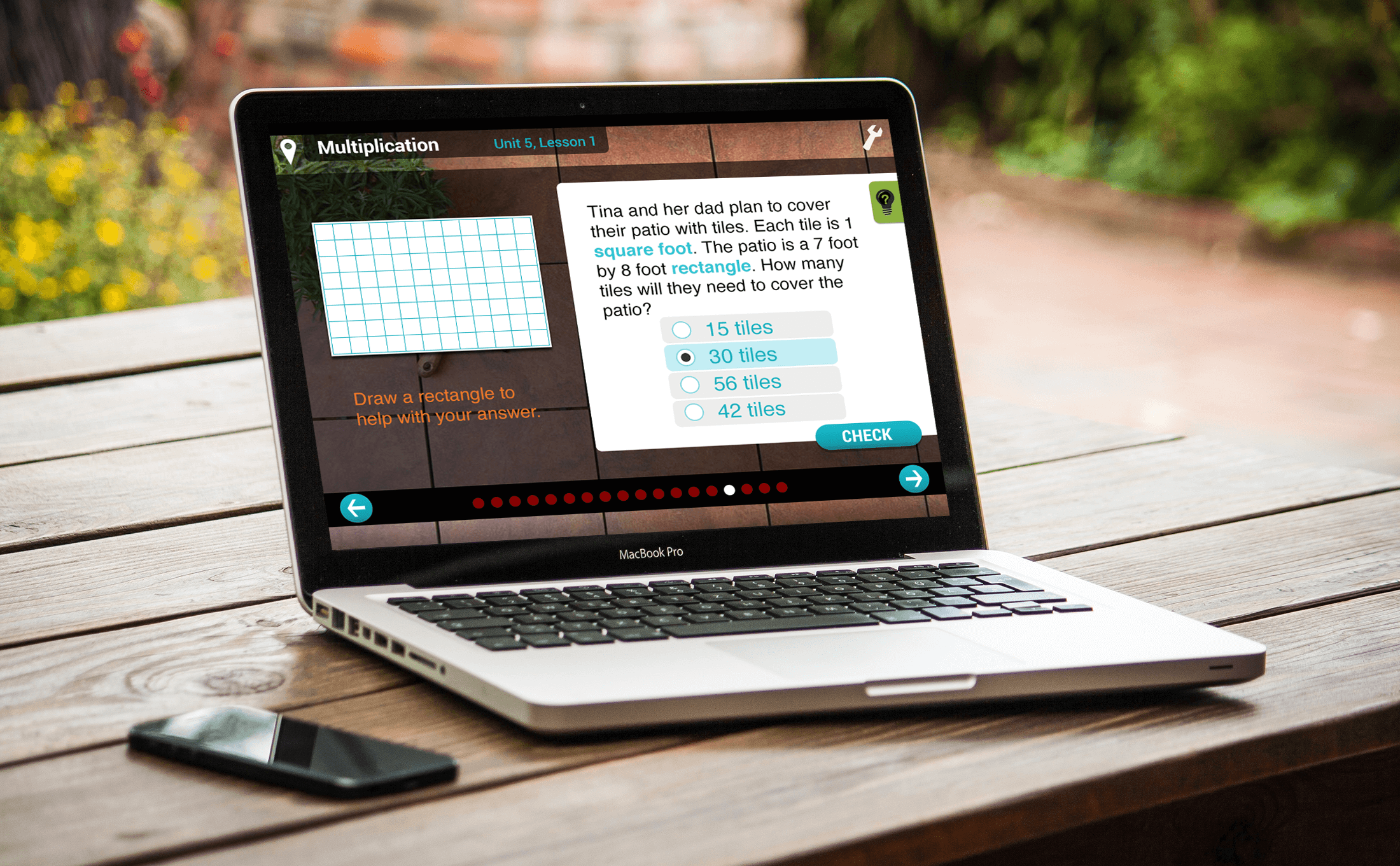
Visual and UI/UX design for Redbird Advanced Learning's web application. This was a series of online education courses for kids in grades K-5. Provided concept design, UI and UX design for online courses and educational games.
Conceptual Design, Visual Design, UI/UX design, Illustration
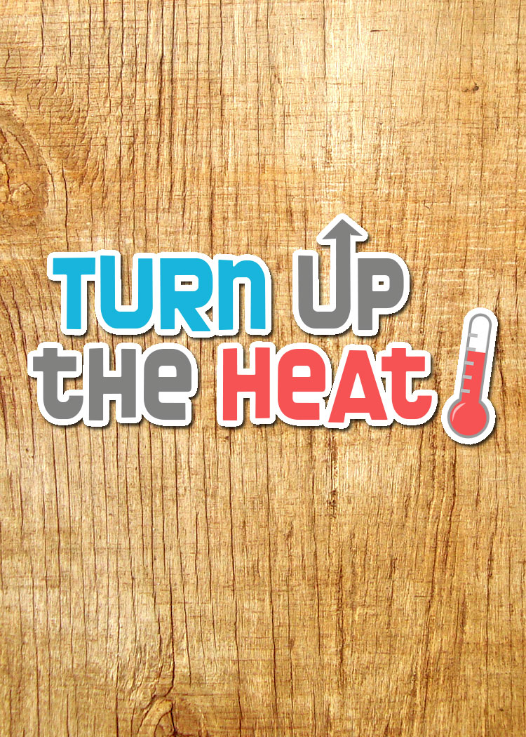
Turn Up the Heat! is an interactive app and board game created for the Tangible Interaction Design and Learning (TIDAL) Lab at Northwestern University. The game teaches energy conservation to kids and families.
From TIDAL Lab: “Turn Up the Heat is the world’s first thermostat board game. Thermostats are widely misunderstood, poorly used, and account for a huge portion of our nation’s energy consumption. To win the game you will need to make careful tradeoffs around comfort, money and the environment. See if your family can survive for a year with limited resources and unfoeseen events.”
I created original game screen designs, character illustrations and logos for both the game and Green Home Games. I also created concept designs for the offline elements such as the game board and player cards.
This game won a 2nd place Showcase Award at the Games+Learning+Society Conference in 2014.
Illustration, Visual Design, User Interface, Graphic Design
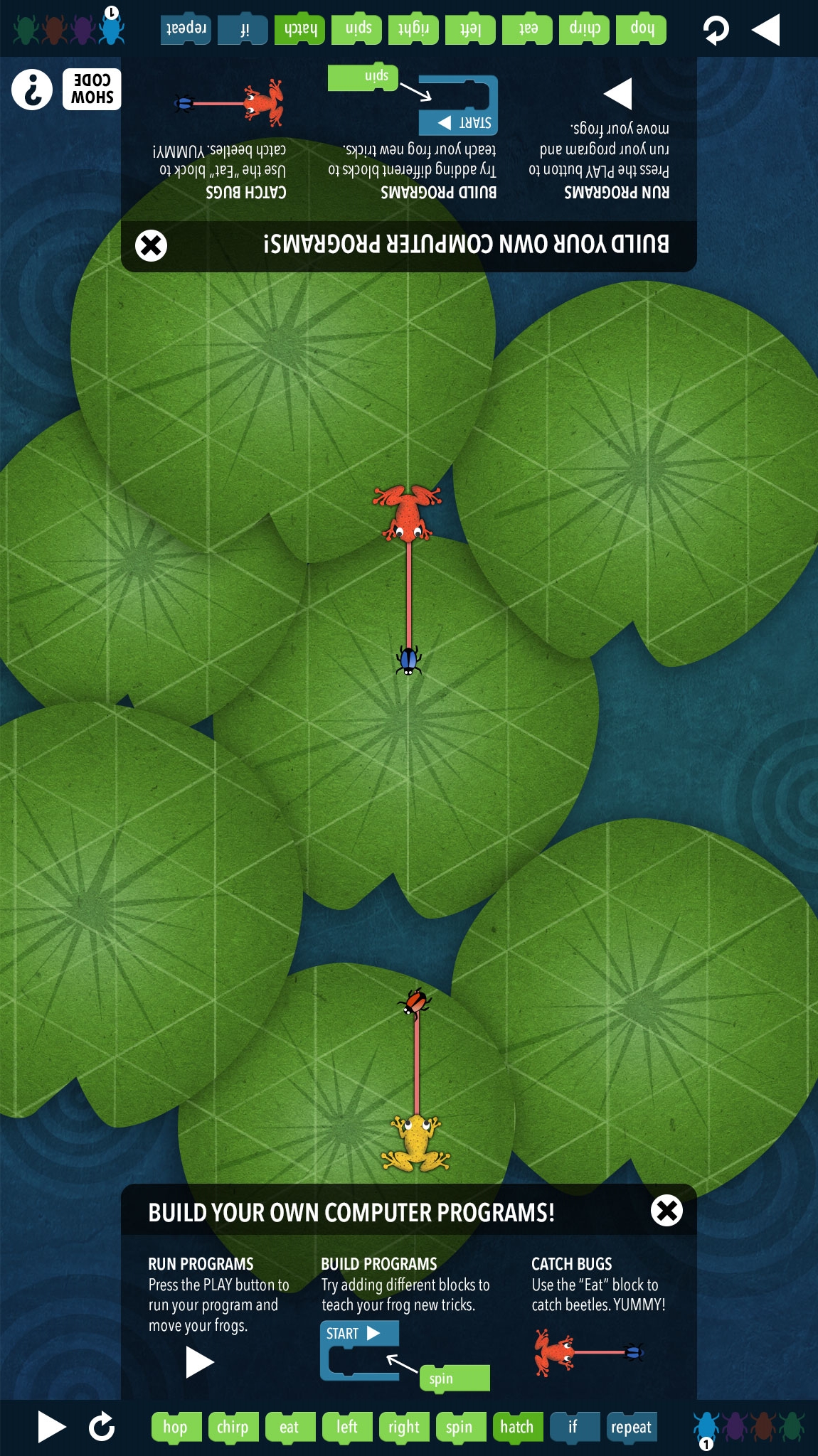
The Frog Pond is an interactive computational literacy exhibit that was developed by TIDAL Lab, a learning project sponsored by Northwestern University, in partnership with the Computer History Museum in Mountain View, California. The exhibit will feature an interactive tabletop with a graphical programming language. Visitors create simple computer programs that control the actions of many colorful frogs that hop around a lily pond and eat beetles.
Visual Design, Illustration
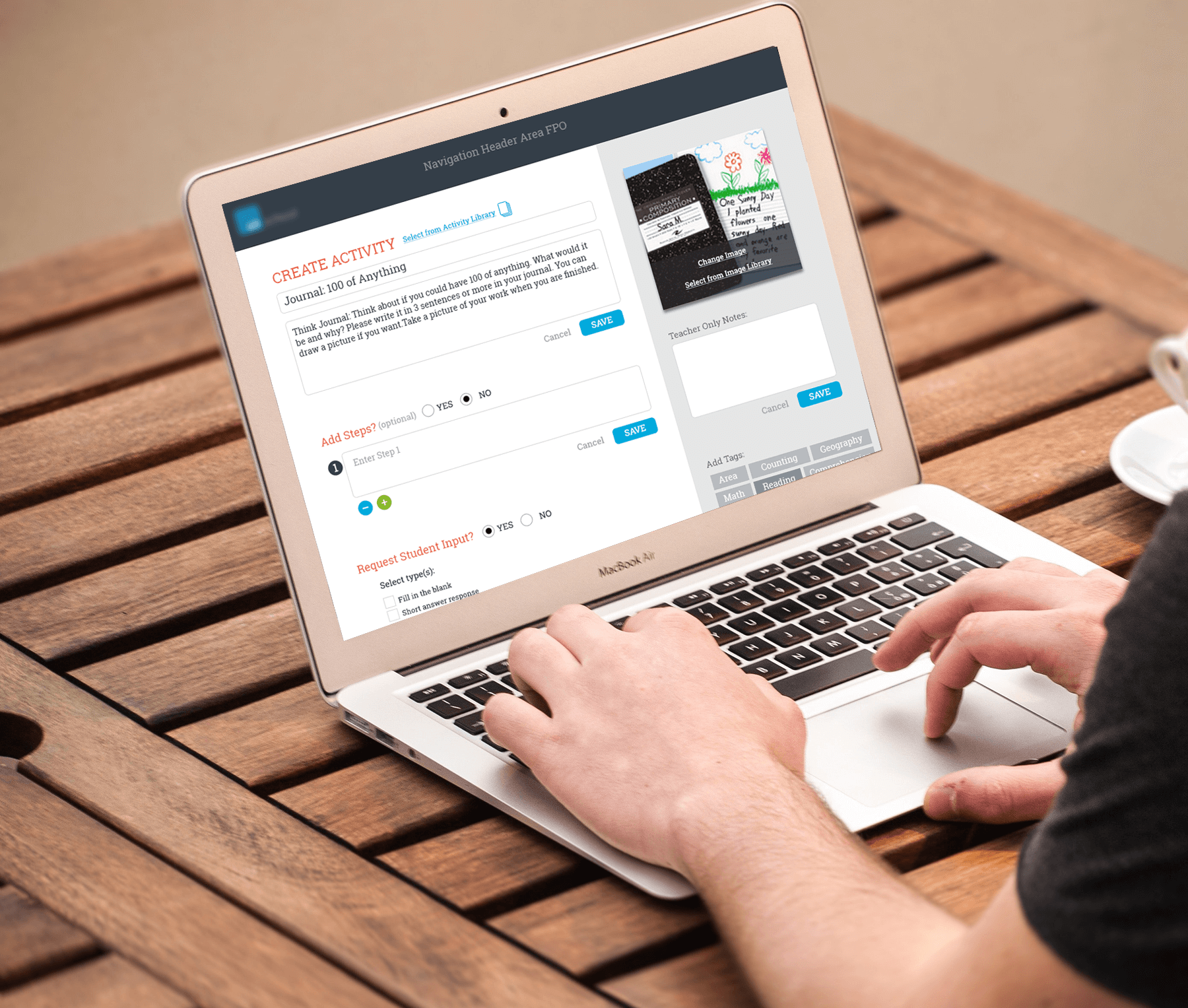
These designs were developed for an educational startup that was developing it’s own software for use in it’s own small schools. The software was meant to be used by both teachers and students. I was tasked with developing a user flow for a teacher creating an activity, editing the activity and sharing it with a student’s “playlist”. These were early stage designs.
UX Design, UI Design
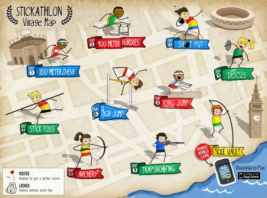
The AddictingGames Stickathlon event was launched to coincide with the London Summer Olympics. As Art Director, I created a style guide for game developers, worked closely with our lead designer to develop the look and feel of the event, and designed the map that served as the main point of entry for users. The Addicting Games Stickathlon had millions of page views. It was a hugely popular event on our site and was consistently one of our top games during the weeks it was promoted.
Art Direction, Visual Design, Illustration
These avatars were created for NickJr. Boost. Targeted for children ages 4 - 7. Children were able to create an avatar by customizing hairstyle, hair color, skin color, eye color, facial features, clothing, and accessories. I art directed and helped develop the avatar style, and then created most of the hairstyles, clothing and accessories. Illustrated and animated in Flash.
Art Direction, Illustration
Tenth Planet Explorations created secondary curriculum for elementary school kids. I created these animated videos to help explain letter sounds, addition, counting by 2s, 5s and 10s to elementary school students in K-2 grades. These videos will play, please tap the thumbnail images to watch!
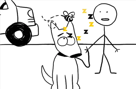
Letter Sounds: This animated video introduces the concept of letter sounds through an animated story about a flat tire, a dog, and the hot sun.
Down by the Bay: Using the classic children’s song, we introduce rhyming words to children.
Flea Circus: Animated video that introduces the mathematical concepts of addition and subtraction.
Number Detectives, Group Counting: This animation introduces the concept of counting by 2s, 5s and 10s with a story about a special brand of detectives, searching for a missing number, each using their own special method for counting.
Recently rebranded as Nickelodeon Addicting Games, the mobile app had to be updated with a new logo and look and feel. In a short time frame, the mobile app needed to be rebranded without changing any layout or size dimensions. This was done with some subtle changes to art, and background and text color changes. The end result is a very different looking app representing the new Nickelodeon Addicting Games brand.
Scroll down for more screenshots or download the app.
Visual Design
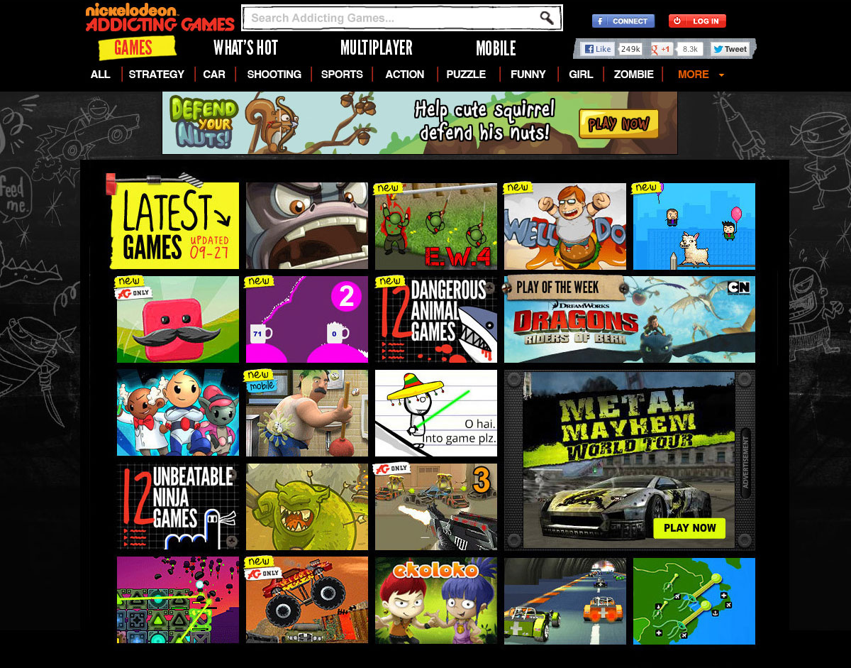
I was the Art Director for the recent Addicting Games redesign. Recently rebranded as Nickelodeon Addicting Games, the website needed to be updated with a new logo and look & feel. With only 9 weeks to complete this project, we found ways to create something that was more than a reskin, but less than a complete overhaul of the site. By injecting new imagery, new picon treatments, a few layout changes and some subtle changes to existing art, we were able to create what felt like a very different site without changing too much of the original layout and keeping most of the feature functionality the same. Addicting Games is one of the largest online game sites in the US, reaching over 10 million unique users every month (comScore).
Target Audience: 14-17 (10-13 piggybacking), primarily boys
Positioning: Irreverence, Cool older brother you want to emulate, Ridiculous, Fun, Absurd, Outrageous
Art Direction, Visual Design
Home Page of the newly rebranded website.
I was a designer for the “Invasion of the Energy Monsters”, a cooperative tabletop board game created for TIDAL Labs at Northwestern University that was designed to encourage entire families to reflect on how to use energy at home and to think about implications for global environmental sustainability.
I illustrated background tiles for use in the board game and also created some early concept designs for the monsters.
The game was awarded 1st place in the showcase competition at the Games, Learning and Society (GLS’16) conference.
Illustration, Concept Design
Examples of various illustrations, created for Tenth Planet Explorations educational games and the Shockwave website and more.
Various character designs created for kids’ educational games and personal projects.
Character design, Illustration
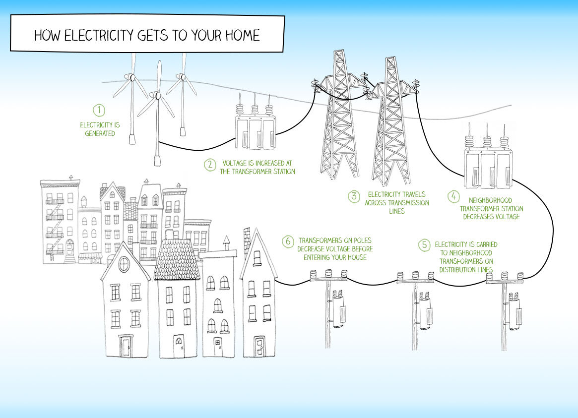
Proposed infographic illustration and website design for Green Home Games, a learning project for TIDAL Labs at Northwestern University. Green Home Games creates playful activities for families to learn about energy consumption in homes. I created their logo and website design.
Illustration, Visual Design, UI Design, Logo Design